Ad Dissection: Pushing a Brand When the Time’s Right
The detail and imagination that go into our creations aren’t always easy to recognize immediately. Ad Dissection gives you an intimate look at all the thought and intention going on below the surface of our designs.
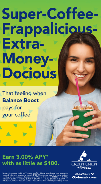
Balance Boost is a money market account offered by our client Credit Union of America. It’s poised to be a game-changer in their market, so we proposed a launch campaign that would be a little more adventurous with the brand but still maintain consistency. This is how we crafted a campaign that stood out without breaking away from brand standards.
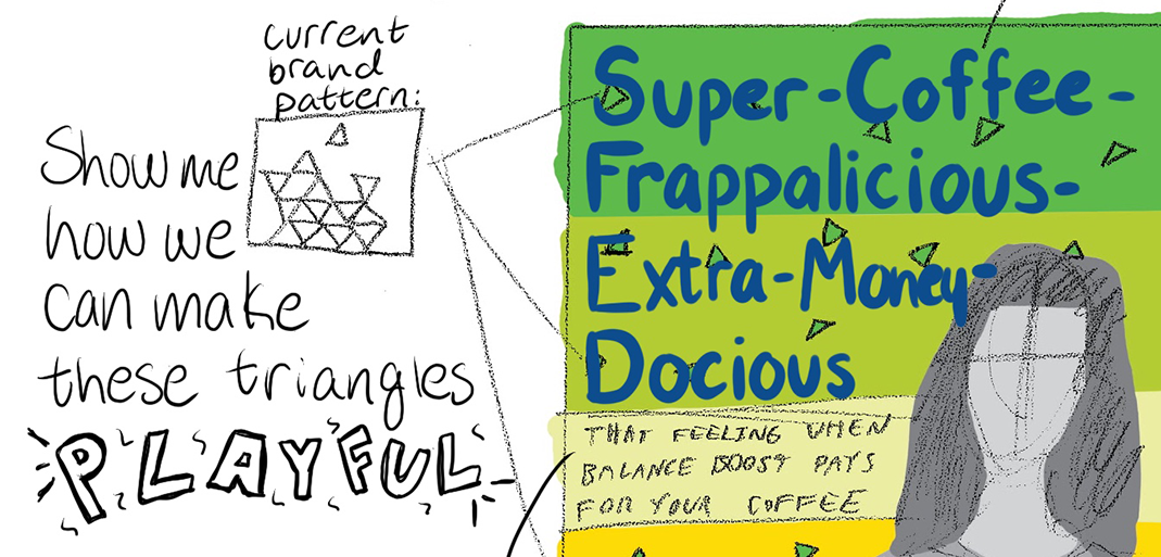
Credit Union of America wanted to target young audiences, so we adapted CUA’s normal triangle pattern, but used bold colors from the brand palette. This gave the ads a bit of a 90s throwback feel (a trendy design aesthetic) without being too trendy or deviating too far from brand standards. In addition to making the ads more interesting overall, this slightly abstracted pattern also gave the design some texture.
Copy treatment in the headline was larger than normal for another subtle way to set this campaign apart from CUA’s other marketing materials. The large type also helps convey excitement. We kept CUA’s avenir font for brand consistency since the headline is such a key feature of the ad.
Creating a long, made-up word for our headline contributed to the boldness of the design. It’s just far enough off the brand’s normal tone to turn heads.
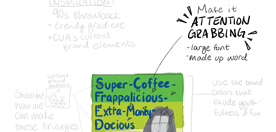
Using a green to yellow gradient helped achieve the design aesthetic we wanted and also creates some dimension within the ad. The dimensionality combined with the colors and abstract copy made the design bold and eye-catching. These colors are secondary brand colors for CUA, making the ad fresh yet distinctly CUA. The combination of these two colors also helped reinforce the exciting, youthful tone of the campaign.

Reaching younger members was a big goal of the campaign, so the visuals needed to reflect that. Younger generations love their coffee drinks, making it a great frame of reference for how much interest you can earn with the account. The subject is camera aware, a brand element we ultimately decided to keep for the campaign. We chose an overtly happy looking young woman in the photo to appeal to younger members and show just how excited you should be to earn all that free money. Targeting Millennials and members of Gen Z in financial advertising is generally a relatively untapped market due to the misnomer that younger generations don’t prioritize saving money. However, younger audiences are much more financially savvy than most brands give them credit for, so we knew this campaign would be a big opportunity to capture their attention. 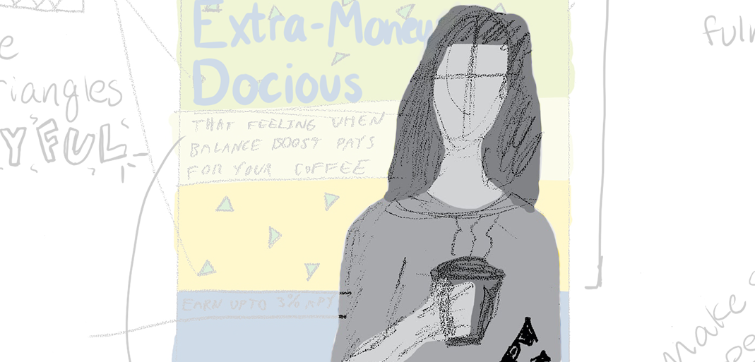
Since we pushed the limits of the brand in certain areas, we wanted to anchor the brand standards within the footer. In most media for CUA, we treat footers the same way, with brand blue and the CUA logo, which has made it one of the most recognizable brand elements. It became an easy way for us to reign in the design from a brand consistency standpoint.
Of course, we had to keep the basics of good advertising in mind. To draw the eye to the call to action, we design the copy to contrast from the rest of the branded footer.

After several iterations and finesse work, this brand breakaway was a success in both our eyes and our clients’ eyes. This campaign explored new avenues in the CUA brand with the goal of maintaining overall brand consistency. Working with credit unions for more than a decade has given us a keen understanding how to leverage and grow financial brands, and the Balance Boost campaign is an example of this that we’re proud of.